Showing posts with label specialty jersey. Show all posts

Monday, July 23, 2012

Monday, July 23: A Typical Vancouver Monday

Municipal Flag of Vancouver
I am feeling very "Vancouver" today. Got out to watch the Whitecaps reserves in action (in the rain) this morning, and now sit in a coffee shop sipping a latté and writing this post. Typical Vancouver.

Today's concepts are based off of the municipal flag of Vancouver.
Provincial Flag of British Columbia
I have always liked the Vancouver flag, it has a good colour scheme; as I have said before, blue white and green really fits the city of Vancouver. I also really like the symbolism of it: The blue and white lines represent the ocean, the green represents the land which Vancouver was built on, and the emblem uses symbols from heraldry to tell us that this is a flag of a city (the crown represents this), built on the industries of forestry (the axe), and shipping/fishing (the paddle). I also like the strong connection to British Columbia's provincial flag with the wavy blue and white lines.

The concept by Jets96, which I posted last friday really got me thinking. I said that it reminded me of the Drummondville Voltigeurs sweaters. I have wanted to design a sweater based on the flag of Vancouver for a while, but was hesitant to because I wasn't sure how to deal with the wavy lines. I didn't want it to end up looking like this. Seeing Jets96's concept, and seeing that the Voltigeurs sweater  also had a V logo with a Voltigeur (infantryman) gave me some direction with this idea.

here is what I came up with:


These sweaters are not a simple transfer of the flag to the sweater (as I have done with my other flag jerseys), there is more symbolism employed. 

Firstly, I realize that the striping does not look exactly like the stripes on the flag. The stripes are supposed to represent water, so I tried to combine some ideas from other teams sweaters which have used stripes to represent water (notably the Rimouski Océanic, on their logo, old sweaters, and new sweaters), and fit them within the basic shape and patter of the Voltigeurs (which forms a slight V, to stand for Vancouver, in this case)

another thing I like about this slight V is that it is similar to the V formed if You rotate the Vancouver municipal flag.

The seafaring trades represented on the flag by an oar, and the ocean are represented on this sweater by the ocean only, while forestry is represented by everyone's favourite lumberjack, Johnny Canuck.

Let me know what you think of these. They were something I threw together just for fun, and I am not super pleased with them, but do think that there are some interesting ideas here. I would be really interested to see what you all thought, and to hear any suggestions you may have.

Thanks for dropping by!

Thursday, July 19, 2012

Thursday, July 19: The Red-Headed League, and Vancouver Brand Blending

As you may know, from reading this blog, although I am first and foremost a Canucks hockey fan, the other teams in Vancouver do occupy a piece of my heart. There is a really interesting trend happening with all of the top level sports teams in Vancouver these days. They are all being led by gingers. This only lead me to like these teams, and the players who lead them even more, as I share the same hair colour (which generations from now will no longer naturally exist). There is a Classic Sherlock Holmes story which includes a large congregation of red-heads which acts as a cover up for a bank robbery. With all the gingers leading Vancouver's sports teams right now, the red-headed league seems to be taking another form. I may have to do up a poster making use of this Classic Sherlock holmes title, and all these red-headed Vancouver athletes (if and when I get around to it, it will be posted in the Canucks Design section of the blog... if you haven't visited it, check it out!)

The Canucks gingers are now well known around the NHL, and are obviously vital to the team's success. When walking around town (especially if I have a Canucks shirt or jersey on) I often get called "Sedin" or "Schneids."


But these are not the only high profile
ginger athletes in Vancouver these days. Travis Lulay the quarterback for the BC Lions, and the CFL's reigning Most Outstanding Player, the guy who led an 0-5 team all the way to winning the Grey Cup, is also a ginger.


The latest Ginger to arrive on the Vancouver sports scene is Barry Robson. A Scottish international midfielder, who has played for some high profile football (soccer) clubs in Britain, including one of my favourites Celtic FC. Last night Robson scored his first goal (a stunning header) as a Whitecap against David Beckham's LA Galaxy. Unfortunately the Caps blew their 2-0 lead (in the last 10 minutes of the match), and the game ended in a 2-2 draw.


I have wanted to do a Whitecaps inspired Canucks jersey for a while, and figured now was the time.

The Caps white jersey has some really unique elements, but if transferred straight to a hockey sweater, they wouldn't necessarily work as well as they do on the Cap's jerseys.

I really like the unique striping pattern on the front of the jersey. It is a look that works really well on a soccer kit, but I am sure would never fly for hockey.

I also really like the Caps colour scheme, and it has worked on hockey uniforms in the past (especially Pittsburgh Penguins sweaters).

I also like some of the small details on the jersey which reference the club's history, and identity (like the "since 1974" on the neck, and the WFC inside the collar.

HOWEVER, there are things which needed to be altered slightly for me to work within the parameters of a Canucks hockey sweater.

First off was the main crest. I couldn't use a whitecaps logo on a Canucks uniform. But I wanted to keep the colour scheme, and clean classic feel of the kit. There is really only one clean and classic Canucks logo which slightly resembles this crest, and would look decent enough in this place on a sweater. The VC logo (clearly one of my favourites right now!) I recoloured it to fit the double blue colour scheme, and added a silver outline, like the Whitecaps main crest.

There are other logos on the front of the Caps kit which just wouldn't jive with the Canucks. First off the Adidas logo. As the NHL has a contract with Reebok to make their jerseys, an adidas logo would NEVER show up on the front of a current NHL sweater. Secondly the Canucks play at ROGERS arena, and would likely never display a BELL jersey sponsorship on the front of their sweaters (for international readers Rogers and Bell are two of the top telecom companies in Canada, and are always competing). The solution to these problems was simple, switch Adidas for Reebok, and Bell for Rogers.

I also subbed the MLS patch for a recoloured stich in the rink patch, and left the Canadian flag as is.

Then Came the most challenging bit filling out the jersey. This jersey is white and, especially with removing all traces of Adidas (the arm stripes included), it can look very empty when transferred directly to a hockey sweater. I altered the striping on the chest slightly to make it make a little more sense on a hockey sweater, and added vertical arm striping (thinner than usual) to make up for the void left when the three Adidas stripes were removed. I also included the light blue in these stripes, because I think it is overall underused in these kits.


The equipment was simple. I could really do whatever I wanted, because the Caps wear all white shorts and socks (aside from the Adidas stripes and branding) so I just made up some stuff that I thought worked well. The pants have three stripes on them (which hint at the Adidas styling) and the socks feature navy and light blue hoops (I really hope the Whitecaps introduce hooped uniforms sometime in the future. I think they always look sharp). 


hope you enjoy this concept!


Thursday, July 12, 2012

The Cascadia Canucks?

As you may be able to tell from reading this blog, when I design hockey jerseys, I am not afraid to draw inspiration from other sports, or sports teams, or sports teams kits. And as you may be able to guess, I am a big fan of many sports teams in the Pacific Northwest. In 2011, Vancouver Whitecaps FC joined Major League Soccer. This moved has really raised the profile of soccer in the Northwest, and has propelled the Whitecaps (and soccer) to second place in terms of my favourite teams/sports (the Canucks and Hockey will always be number 1!).

One thing that is really great about soccer is the local rivalries (hockey could really take some cues from this I think), and the local rivalry between the Seattle Sounders, Portland Timbers, and Vancouver Whitecaps is always fierce. Every year the Cascadia Cup is awarded to the team from this group who fared best against their rivals. The Whitecaps have won the Cascadia cup 3 times since it was first awarded in 2004, and look poised to win it again!

The trophy is named for the geographic region which these teams are all from. There is a movement in the Northwest (British Columbia, Washington, Oregon) to break away from Canada and the USA and form an independant country called Cascadia. Although there is a distinct culture shared by the inhabitants of these areas, this movement is not well supported (it is more of a cultural thing than a political thing), but is nonetheless interesting (check out wikipedia if you are interested...clearly I was).

Supporters from these clubs (especially the Timbers Army) have really embraced their Cascadian identity, and have begun to fly Cascadian flags at matches. When I first saw them, the first thing I noticed was that they are blue, white, and green. THE SAME COLOURS AS THE CANUCKS!

My concepts for today are similar to the Canada day concepts I posted. Instead they feature the Cascadian Flag in the Stick in the Rink logo. I have also put a modified version of the Cascadian flag on the arm stripes, with the douglas fir acting as a patch on the sleeves. The stripes all follow the colour and pattern of the Cascadian flag. The jersey itself follows the current Canucks alternate template, but with forest green as the main colour rather than blue.

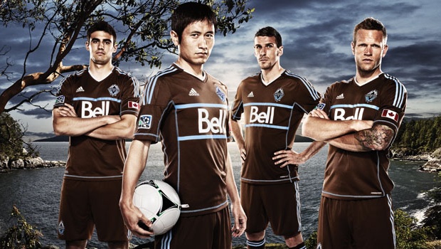
In soccer it is much more acceptable for a team to use a colour which is not in the teams colour palate as a main colour on an alternate kit. The Whitecaps have recently introduced a BROWN kit (I didn't like it at first, I was hoping for a light blue throwback uniform, but it is REALLY growing on me). This practice is not so acceptable in the world of hockey, but if it were more acceptable, I think forest green could look really good on the Canucks.

Anyways enough with soccer and secessionism. You came to see concepts so I'd better get on with them.

Home:


What better player to feature on the back of these sweaters than Jason Garrison. Glad to have a local boy (from White Rock, Cascadia... errr BC!) and one of his quality join the squad. 

Away:


Come back tomorrow to see some concepts by a new contributor.
As for next week, I can't promise t will be as productive as this one, but I do have plans to re-work the green alternate sweater which I designed a while ago. We'll see how that goes.

Thanks for reading!

Sunday, July 1, 2012

Oh Canada!

Hello Everyone! Happy Canada Day! If you are not a Canadian reading this blog, do tough it out. I will talk about some stuff which will interest Americans, like baseball.


Anyways, for us Canadians, hockey is something that really draws us together. However it is only once the snow and ice have melted that we take time to celebrate everything great about our country (officially at least!) Canada Day is here, and I can think of no better thing to do than post some hockey jerseys.


Ironically, the inspiration for these Canada Day themed Canucks sweaters come from the world of baseball. In the MLB every July 4th (and Memorial Day, also, I think...) every team rolls out a specialty uniform featuring the teams logo with some alterations made to make them more patriotic. This has usually been stars and stripes inlaid within the logo, unless you're the Blue Jays, they have a red and white maple leaf design.


My local baseball team the Vancouver Canadians are the single A affiliate of the Toronto Blue Jays, and have joined in the tradition of wearing patriotic caps on Canada day as well. How could they not do this? Their name is the CANADIANS!   


Canuck is also a slang term for a Canadian, so it would make sense if the Canucks decided to produce a specialty uniform for use on Canada day. Unfortunately, the Canucks will probably never play a game on Canada day, so them wearing special Canada day uniforms will never happen. Nonetheless, I have made them up. Enjoy!


I have chose Roberto Luongo's name to go on these sweaters for two reasons. The first being, that Luongo has had the most success when playing in Vancouver, wearing a Canadian uniform. The second being that with Schneider being re-signed, and with it being July 1st and free agency opening up potential for signings and moves, it may be my last chance to put Luongo's name on the back of a jersey on this blog.

For this jersey I have tried to keep the striping simple and classic, so as to not take away from any of the  specialty elements on the jersey.


The logo is the Canucks' Stick in the Rink crest re-coloured to fit the Canadian flag, which shows up in the background of the "rink," just like it would on an MLB "Stars and Stripes" baseball cap. I also drew some more inspiration from baseball on this sweater. The numbers in the maple leaf patch was a feature on the Vancouver Canadians Canada day uniform last year.
I also made a white version to match the red jersey.


And since these uniforms were largely inspired by the Vancouver Canadians baseball sweaters, I thought it would be a neat idea to do one in their colour scheme, and include black on the jerseys. Admittedly this last one is my least favourite, they are definitely "black for black's sake," but I thought I should try to pay some homage to the team which was the inspiration for these sweaters.