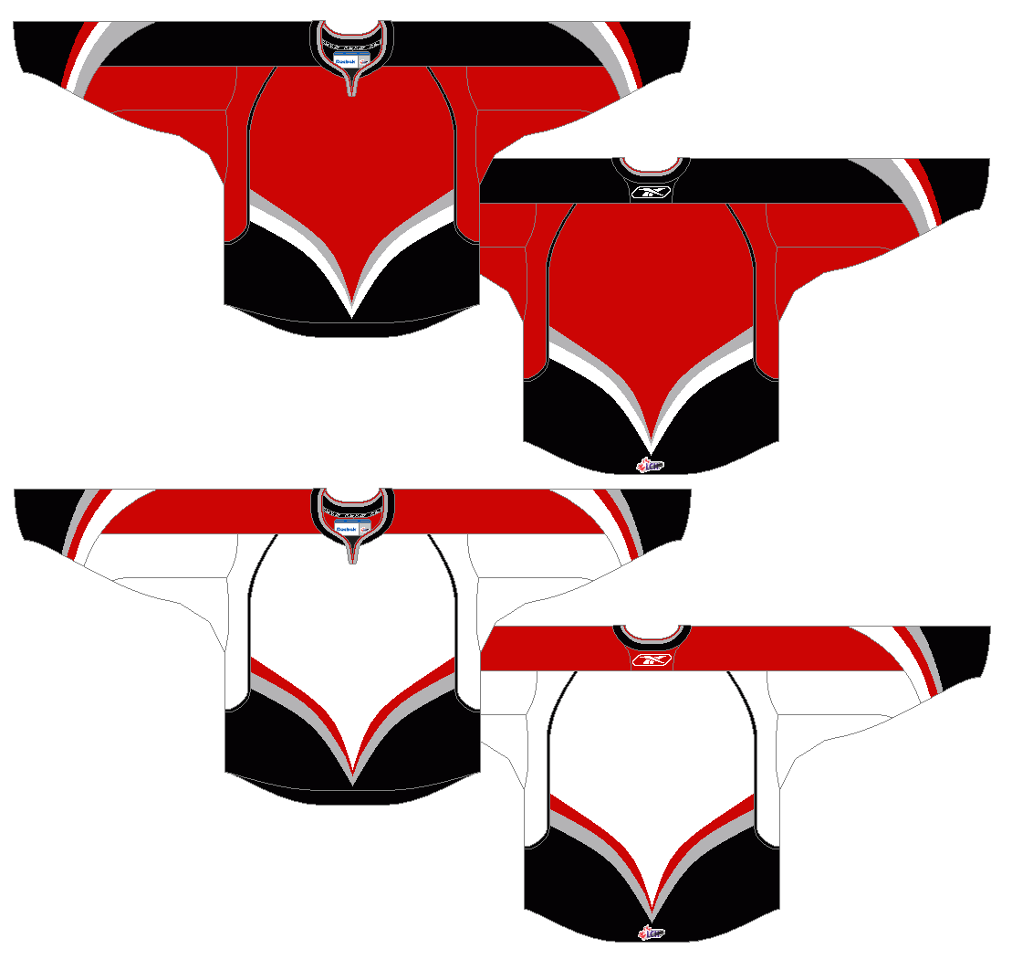
Matt Marczel is back with his proposal for a Canucks alternate:
I like what Matt has done here. It's green. It's vintage inspired. You gotta know I'm gonna like this!
The work on the logo is superb. I especially like the diamonds, they really fill out the circle. I am not sold on the off colour name-plate. I can't say it looks bad, because it looks good, but that element really belongs to Philadelphia. Overall really solid work.
If you have any comments or suggestions for Matt, please post them in the comments below.
Thanks for reading!
Showing posts with label contributors concepts. Show all posts
Friday, August 17, 2012
Friday, August 10, 2012
Friday, August 10: Contributors Concepts
Hey everyone, sorry for the lack of posts lately. Life is busy between finishing up summer classes, and preparing to go away next week. Honestly, I don't think I will be able to get a midweek post up this week, but I may have some time to work on concepts, which would mean I would have a solid set of posts for the following week. There will a friday post for sure next week.
These last few weeks have been a bit of a dry stretch for SOAC, simply because I have not had a lot of time to do concept work. I will probably not have enough time to create enough Canucks concepts to fuel this blog the way I have for the past couple months in the future. I will be writing for HJC, in addition to SOAC come the end of August, and I know I will have less time for PURELY Canucks concept work.
SO, I want to encourage you readers to send me your Canucks concepts. My concepts alone will not keep this blog going (In truth I am scraping the bottom of my barrel for Canucks concept ideas, and am tiring of having to make basically only Canucks concepts to provide enough material for SOAC), and it would really take some pressure off of me if I could feature more work from others on this blog. Please send your work in to me: shirtofacanuck@gmail.com
As mentioned earlier this week, Matt Marczel makes his SOAC concept debut this friday. Matt sends along his ideal Canucks home and road uniforms. The look of every ideal Canucks set that has been set in to SOAC follows the same basic idea (Use the current third jersey, or a slight variation of it, as the home sweater, and create a matching road jersey). Matt does the same here, BUT also sends along another option which he would consider if he were in charge of choosing Canucks unis.
The striping pattern used looks really great on the home sweater, but looks a little awkward on the away sweater. I actually don't think the blue cuffs are necessary. If you are going to use them, I would either make them small cuffs, like on the habs uniform, or merge the lower blue stripe with the cuff (so remove the low white stripe). but really I think it would look best with no cuffs at all.
I really like the gloves, they are simple and cool, and really hearken back to the uniforms from the 70's.
The second set Matt sends along is one he would consider for the main home and road sweaters. I have made similar sweaters, and think that they would be best suited as home and road alternates (if the NHL allowed teams to wear more jerseys).
These last few weeks have been a bit of a dry stretch for SOAC, simply because I have not had a lot of time to do concept work. I will probably not have enough time to create enough Canucks concepts to fuel this blog the way I have for the past couple months in the future. I will be writing for HJC, in addition to SOAC come the end of August, and I know I will have less time for PURELY Canucks concept work.
SO, I want to encourage you readers to send me your Canucks concepts. My concepts alone will not keep this blog going (In truth I am scraping the bottom of my barrel for Canucks concept ideas, and am tiring of having to make basically only Canucks concepts to provide enough material for SOAC), and it would really take some pressure off of me if I could feature more work from others on this blog. Please send your work in to me: shirtofacanuck@gmail.com
As mentioned earlier this week, Matt Marczel makes his SOAC concept debut this friday. Matt sends along his ideal Canucks home and road uniforms. The look of every ideal Canucks set that has been set in to SOAC follows the same basic idea (Use the current third jersey, or a slight variation of it, as the home sweater, and create a matching road jersey). Matt does the same here, BUT also sends along another option which he would consider if he were in charge of choosing Canucks unis.
The striping pattern used looks really great on the home sweater, but looks a little awkward on the away sweater. I actually don't think the blue cuffs are necessary. If you are going to use them, I would either make them small cuffs, like on the habs uniform, or merge the lower blue stripe with the cuff (so remove the low white stripe). but really I think it would look best with no cuffs at all.
I really like the gloves, they are simple and cool, and really hearken back to the uniforms from the 70's.
The second set Matt sends along is one he would consider for the main home and road sweaters. I have made similar sweaters, and think that they would be best suited as home and road alternates (if the NHL allowed teams to wear more jerseys).
What do you think of these sweaters? If you have any brilliant ideas for Matt, please post them in the comments below.
We will see a proposition for a third jersey to go along with these home and away options from Matt next friday!
Thanks for dropping by!
Friday, August 3, 2012
Friday, August 3: Contributor Concepts
This week we have another concept from Steven. Some of you may have seen this on other sites, like Icethetics, or HJC, or even on Steven's own blog, but I still wanted to post these on SOAC. I actually requested he send them in, thankfully Steven obliged, although he was a bit hesitant, because he probably wouldn't want the Canucks to wear these in real life.
What I like most about these concepts is Steven's tremendous creativity. These concepts are not what you expect a traditional hockey uniform to look like, but they are clever, and well polished. I really do appreciate it when artists try to be creative, and take some risks with designs.
The first version of this concept is a quite risky with the two-tone, sublimated green chevron pattern, and overall it does make the jersey seem a bit busy.
The second one eliminates the sublimated green chevrons, and goes with a simple green base. I really like this jersey with the simplifications.

This type of chest stripe seems right out of the world of soccer to me (clearly during the summer months, my mind seems to go to this world...). It reminds me of the kits worn by both the Canadian Women's National team, and Manchester United, both of which look really sharp.
What I like most about these concepts is Steven's tremendous creativity. These concepts are not what you expect a traditional hockey uniform to look like, but they are clever, and well polished. I really do appreciate it when artists try to be creative, and take some risks with designs.
The first version of this concept is a quite risky with the two-tone, sublimated green chevron pattern, and overall it does make the jersey seem a bit busy.
The second one eliminates the sublimated green chevrons, and goes with a simple green base. I really like this jersey with the simplifications.

This type of chest stripe seems right out of the world of soccer to me (clearly during the summer months, my mind seems to go to this world...). It reminds me of the kits worn by both the Canadian Women's National team, and Manchester United, both of which look really sharp.
Friday, July 27, 2012
Friday, July 27: Contributor Concepts
Hey everyone, we've made it to yet another friday, which means we have some more work from people other than me.
Before we get to that, a bit of housekeeping. As I mentioned, next week I will be on vacation, and have set up some auto-posts to go up while I am away. I laid out a schedule of these posts on Wednesday, but have had to scrap one of the posts (the one on monday, simply because I did not have enough time to write it, and do everything else which I needed to do before I left). There will be posts on wednesday and friday, and I hope to finish the scrapped monday post when I return home on thursday, and post it on the weekend.
Anyways, lets get on with the concepts:
This week marks the debut of Steven Grant on the blog. Steven runs his own concept site (sg-94.blogspot.ca) but has kindly sent along some Canucks concept work to me.
Steven sent along his ideal Canucks sweater set. The home and road sweaters are very similar to the sweaters worn from 1972-1978, except the logos have been slightly altered, making the overall shape and outline pattern really similar to the current updated Stick in the Rink logo, but maintaining the simple "stick" part of the logo, and staying true to the original colouring of the jerseys. I really like these subtle changes. Good work, they really do make a difference. As you probably know, I am not a fan of the striping pattern introduced in 1972 (I have always thought that the 1970-72 striping was much more creative), but I really can't complain about my personal preference. This look is classic, and well put together.
THE THIRD JERSEY IS AWESOME!!! It's green. It's retro. It uses the VC logo. It reminds us of the millionaires jersey. If I were me making this sweater, I might make the hem stripes straight, and I might make the shoulder numbers a bit bigger. Other than that, no complaints. Really well done Steven, I look forward to seeing and posting more of your Canucks concepts.
Thanks for stopping by, and thanks for reading! I look forward to seeing your comments, and emails when I get back!
Before we get to that, a bit of housekeeping. As I mentioned, next week I will be on vacation, and have set up some auto-posts to go up while I am away. I laid out a schedule of these posts on Wednesday, but have had to scrap one of the posts (the one on monday, simply because I did not have enough time to write it, and do everything else which I needed to do before I left). There will be posts on wednesday and friday, and I hope to finish the scrapped monday post when I return home on thursday, and post it on the weekend.
Anyways, lets get on with the concepts:
This week marks the debut of Steven Grant on the blog. Steven runs his own concept site (sg-94.blogspot.ca) but has kindly sent along some Canucks concept work to me.
Steven sent along his ideal Canucks sweater set. The home and road sweaters are very similar to the sweaters worn from 1972-1978, except the logos have been slightly altered, making the overall shape and outline pattern really similar to the current updated Stick in the Rink logo, but maintaining the simple "stick" part of the logo, and staying true to the original colouring of the jerseys. I really like these subtle changes. Good work, they really do make a difference. As you probably know, I am not a fan of the striping pattern introduced in 1972 (I have always thought that the 1970-72 striping was much more creative), but I really can't complain about my personal preference. This look is classic, and well put together.
THE THIRD JERSEY IS AWESOME!!! It's green. It's retro. It uses the VC logo. It reminds us of the millionaires jersey. If I were me making this sweater, I might make the hem stripes straight, and I might make the shoulder numbers a bit bigger. Other than that, no complaints. Really well done Steven, I look forward to seeing and posting more of your Canucks concepts.
Thanks for stopping by, and thanks for reading! I look forward to seeing your comments, and emails when I get back!
Friday, July 20, 2012
Friday July 20th: Contributor Concepts
Again this week we have more Black-Red-Yellow concepts from WinnipegJets96!
These concepts have some real potential, and with a bit of polishing could be real winners.
First off, I like the top version (without white) better, it just looks more sleeker.
I also really like the creativity of the design. It reminds me of the Drummondville Voltigeurs sweaters.
When I look at the bottom half (from the hem up to where the arm stripes cut off) of the first sweater, it looks like it belongs in the Canucks wardrobe from the late 80' early 90's. THE FEEL IS THERE!
however, when I look further up the jersey it appears empty, and loses that feel.
Here are some suggestions to help fix this:
- don't cut the V striping off on the sleeves. continue them all the way to the inside edge of the arms.
- maybe simplify the logo a bit (I find that this logo looks way clearer if you take away the small white lines inside the plate). It would be okay to do this in paint on a large version of the logo, and then shrink it down to the right size, then everything should look clear enough.
- everything on this jersey seems a bit low. I would make the logo slightly larger and then move it up on the chest. I would also make the angle of the V slightly steeper, and then continue it further up the jersey.
- the top half of the jersey seems a bit empty. moving everything up would help this, but to fight the emptiness at the top of the sweater I would also make the arm numbers slightly larger (and move them up a bit). Also for the arm numbers I would rotate them slightly (a 10º rotation works well on this template), to fit them to the template better.
- maybe adding a vertical arm stripe like Drummondville has on their sweaters could look really cool.
There is a lot to like about this concept, and plenty of potential. I would love to see what Jets96 comes up with from these suggestions!
Thanks for dropping by!
These concepts have some real potential, and with a bit of polishing could be real winners.
First off, I like the top version (without white) better, it just looks more sleeker.
I also really like the creativity of the design. It reminds me of the Drummondville Voltigeurs sweaters.
When I look at the bottom half (from the hem up to where the arm stripes cut off) of the first sweater, it looks like it belongs in the Canucks wardrobe from the late 80' early 90's. THE FEEL IS THERE!
however, when I look further up the jersey it appears empty, and loses that feel.
Here are some suggestions to help fix this:
- don't cut the V striping off on the sleeves. continue them all the way to the inside edge of the arms.
- maybe simplify the logo a bit (I find that this logo looks way clearer if you take away the small white lines inside the plate). It would be okay to do this in paint on a large version of the logo, and then shrink it down to the right size, then everything should look clear enough.
- everything on this jersey seems a bit low. I would make the logo slightly larger and then move it up on the chest. I would also make the angle of the V slightly steeper, and then continue it further up the jersey.
- the top half of the jersey seems a bit empty. moving everything up would help this, but to fight the emptiness at the top of the sweater I would also make the arm numbers slightly larger (and move them up a bit). Also for the arm numbers I would rotate them slightly (a 10º rotation works well on this template), to fit them to the template better.
- maybe adding a vertical arm stripe like Drummondville has on their sweaters could look really cool.
There is a lot to like about this concept, and plenty of potential. I would love to see what Jets96 comes up with from these suggestions!
Thanks for dropping by!
Friday, July 13, 2012
Fan Concept Friday
As promised earlier this week, I have concept art from a new contributor! Canucks fans, don't be scared away by his pen name... he revealed to me in an email that he is in fact a Canucks fan (I never would have guessed!).
Today WiinipegJets96 makes his concept art debut on SOAC. In his email to me, WinnipegJets96 revealed to me that he was actually a Canucks fan and really got interested in hockey in 2003 when he became a fan of the Canucks and their awesome team from that era. He mentioned he was a big fan of Naslund, Linden, the Sedins, Ohlund, and Cloutier... but we know Cloutier had to be a typo, right!?! As many of you may know this era in Canucks history is probably my favourite and Naslund still remains my favourite Canuck.
Jets96 used the look of the 80's and 90's Canucks sweaters as the basis for his concepts, but has tried to update the look.
The thing I like the most about these sweaters are the simple, big, bold stripes on the jersey. They match the "in your face" colours and feel of this uniform really well. I appreciate what the Vs on the cuff are meant to accomplish, but do not think that they are as effective here with these arm stripes. I would leave the cuffs black and move the Vs to the shoulders, like on the 1985-89 uniforms. For the numbers I would go with a consistant colour scheme throughout the jersey. The red numbers seem to "Calgary Flames" to me... not a good thing on a Canucks uniform. I would go with the yellow ones on the back as well. I might also make the front crest logo a bit bigger.
All in all I like these concepts, and think the big, bold, in-your-face vibe they give me fit really well with this colour scheme and logo. Thanks for sending this concept in Jets96. I look forward to seeing more of your work!
For any of you that have concept art, feel free to send it my way. I am hoping to be able to feature at least one concept by someone other than myself every friday. If you have a Canucks themed concept, send it to: shirtofacanuck@gmail.com
thanks for dropping by!
Today WiinipegJets96 makes his concept art debut on SOAC. In his email to me, WinnipegJets96 revealed to me that he was actually a Canucks fan and really got interested in hockey in 2003 when he became a fan of the Canucks and their awesome team from that era. He mentioned he was a big fan of Naslund, Linden, the Sedins, Ohlund, and Cloutier... but we know Cloutier had to be a typo, right!?! As many of you may know this era in Canucks history is probably my favourite and Naslund still remains my favourite Canuck.
Jets96 used the look of the 80's and 90's Canucks sweaters as the basis for his concepts, but has tried to update the look.
The thing I like the most about these sweaters are the simple, big, bold stripes on the jersey. They match the "in your face" colours and feel of this uniform really well. I appreciate what the Vs on the cuff are meant to accomplish, but do not think that they are as effective here with these arm stripes. I would leave the cuffs black and move the Vs to the shoulders, like on the 1985-89 uniforms. For the numbers I would go with a consistant colour scheme throughout the jersey. The red numbers seem to "Calgary Flames" to me... not a good thing on a Canucks uniform. I would go with the yellow ones on the back as well. I might also make the front crest logo a bit bigger.
All in all I like these concepts, and think the big, bold, in-your-face vibe they give me fit really well with this colour scheme and logo. Thanks for sending this concept in Jets96. I look forward to seeing more of your work!
For any of you that have concept art, feel free to send it my way. I am hoping to be able to feature at least one concept by someone other than myself every friday. If you have a Canucks themed concept, send it to: shirtofacanuck@gmail.com
thanks for dropping by!
Tuesday, July 10, 2012
With a Little Help from my Friend.
Hey everyone, I don't know if you recall me mentioning I was working with Justin on a concept. for those of you who have not heard, Justin (from The Art of Hockey) and I have been working on a concept together. It is now complete. Justin approached me with a proposition to use my home and away sweaters, and his third sweater (which was posted in the post I linked to previously in this post) to create a collaborated Canucks uniform set. I agreed, and have had a lot of fun doing this over the past couple weeks.
Working with someone else is great, they can catch your mistakes, make alterations to make the concept better, or you can bounce ideas off of them. But it is not without its challenges. Working on the V in the arm striping took us five back and forths before we came up with something that was as I wanted it (thanks again Justin for putting up with this!), but all the back and forth was worth it because in the end it looks great.
The only real alteration made to my home and road jerseys (other than the template) is in the collar striping. Instead of modelling that after the current Canucks' collars, they are based off the 1970 original jerseys.
A lot has changed in Justin's jersey since its original incarnation. It was giving me a vintage vibe, so that is the direction we took it. We added collar laces, and simplified the striping making white more prevalent and eliminating silver. We also used the Canucks' 40th anniversary numbers, which are big and blocky, and ooze tradition.
All in all we are both really pleased with the alterations made to our work, and I for one think they are better for having input from someone else.
Working with someone else is great, they can catch your mistakes, make alterations to make the concept better, or you can bounce ideas off of them. But it is not without its challenges. Working on the V in the arm striping took us five back and forths before we came up with something that was as I wanted it (thanks again Justin for putting up with this!), but all the back and forth was worth it because in the end it looks great.
The only real alteration made to my home and road jerseys (other than the template) is in the collar striping. Instead of modelling that after the current Canucks' collars, they are based off the 1970 original jerseys.
A lot has changed in Justin's jersey since its original incarnation. It was giving me a vintage vibe, so that is the direction we took it. We added collar laces, and simplified the striping making white more prevalent and eliminating silver. We also used the Canucks' 40th anniversary numbers, which are big and blocky, and ooze tradition.
All in all we are both really pleased with the alterations made to our work, and I for one think they are better for having input from someone else.
Saturday, July 7, 2012
Finally, Some more Flying Vs
Hello again everyone. It has been a slow week on Shirt of a Canuck this week (mainly because it has been a busy week in real life for me). It is the first beautifully sunny Saturday of the summer here in Vancouver, and I (of course) am at home with a cold (probably because I had a busy week). That just means I can catch up on the blog.
Over a week ago I posted concepts from Stéphane and Justin, and hinted at upcoming posts. Today, one of those upcoming posts is here. Today, for your viewing pleasure, I have some blue and green Flying V concepts from Stéphane, Justin, and myself. What I like most about all of these concepts is that they are all very different.
Without further ado, here are the concepts:
Over a week ago I posted concepts from Stéphane and Justin, and hinted at upcoming posts. Today, one of those upcoming posts is here. Today, for your viewing pleasure, I have some blue and green Flying V concepts from Stéphane, Justin, and myself. What I like most about all of these concepts is that they are all very different.
Without further ado, here are the concepts:
Justin's striping design stays very true to the original, with the Vs in the arm stripes. I was unsure about using the stick in the rink logo as a shoulder patch, but it seems to work here. The one thing I would change on this concept is the partial green cuff stripe, I would just keep it blue.
A while ago Stéphane sent in a Flying V concept in the Canucks' Hallowe'en colours. He has sent in a couple more versions of this concept in blue and green. As you will notice, the players he has selected to use for the names and numbers are not Canucks. Stéphane is a Habs fan, and is still a bit sore about losing Lapierre, and has proposed a few trades to me in an attempt to get even for the Lapierre trade. As the unofficial GM of the Canucks I have acquired Scott Gomez from in exchange for a enough money to pay the Electricity Bill in Roger's Arena for the next few seasons, and a one way ticket to Chicago. This jersey would never happen, because Gomez would never wear a Canucks sweater (a Chicago Wolves sweater, maybe?).
My only complaint for this sweater is the use of the Orca logo, which I do not feel represents the Canucks brand well. Other than that it looks awesome.
Stéphane has also sent in a green version, with the Johnny Canuck V logo. This one also looks really good, except for the name on the back. Number 22 IS NOT AVAILABLE.
This is better...
I just wanted to do a version of the Flying V which was different from any other version I have seen. I don't really like how the arm stripes on the original Flying Vs only go part way around the arms. This was a big complaint with arm striping when the Reebok Edge uniform system was introduced. Recently a few teams have taken steps to fix this (notably the LA Kings, and Winnipeg Jets) I started to imagine it based off the Jets away jersey with the arm stripes going all the way around the sleeves, and over top of the vertical striping on the sleeves. What do you think? was the experiment a success?
I also made a matching road version. And since it is meant to match, I didn't really have a choice as to which player I chose for the name and number on the back of the sweater.
Thanks for stopping by!
Sunday, July 1, 2012
UPDATE: Oh Canada!
Stéphane just sent me an email, with a Canucks concept from him for Canada day.
When I was little, I asked my parents what a Canuck was, and they told me it meant a Canadian. This really confused me, because there was already a team in the NHL called the Canadiens (which I knew was the French version of Canadians). So for a while I thought that the Canucks and Canadiens were the same team.
Stéphane's concept reminded me of this story as soon as I looked at it. His purpose was simply to make a bit of a joke. I really do find it funny that two of the seven Canadian NHL teams have variants of the term "Canadian" as their nicknames. I also find it funny that three of the seven Canadian teams have a "C" shaped logo. Stéphane really play this up in this concept, a blending of the Canucks and Canadiens. Hockey is something that unites Canadians from coast to coast, but I think Stéphane may have taken that idea to the extreme with this brand blending concept.
As you will recognize this is a Canadiens home sweater done up in Canucks colours. The C shaped logo switches from the famous CH crest, to the Canucks Orca. This concept has alerted me to another similarity the Canucks and Canadiens share: the arm striping on the home jersey, it is uncanny how similar they are!
Stéphane is a big Lapierre fan, and was very sad to see him traded to Vancouver at the 2011 trade deadline. This concept is an attempt to ease Lapierre out of Vancouver and lure him back to Montréal.
When I was little, I asked my parents what a Canuck was, and they told me it meant a Canadian. This really confused me, because there was already a team in the NHL called the Canadiens (which I knew was the French version of Canadians). So for a while I thought that the Canucks and Canadiens were the same team.
Stéphane's concept reminded me of this story as soon as I looked at it. His purpose was simply to make a bit of a joke. I really do find it funny that two of the seven Canadian NHL teams have variants of the term "Canadian" as their nicknames. I also find it funny that three of the seven Canadian teams have a "C" shaped logo. Stéphane really play this up in this concept, a blending of the Canucks and Canadiens. Hockey is something that unites Canadians from coast to coast, but I think Stéphane may have taken that idea to the extreme with this brand blending concept.
As you will recognize this is a Canadiens home sweater done up in Canucks colours. The C shaped logo switches from the famous CH crest, to the Canucks Orca. This concept has alerted me to another similarity the Canucks and Canadiens share: the arm striping on the home jersey, it is uncanny how similar they are!
Stéphane is a big Lapierre fan, and was very sad to see him traded to Vancouver at the 2011 trade deadline. This concept is an attempt to ease Lapierre out of Vancouver and lure him back to Montréal.
Friday, June 29, 2012
Concepts From Friends Friday!
Hello everyone, we've made it to another friday!
Today I am excited to introduce a new feature on the blog which will hopefully become a regular thing. I have mentioned on previous posts that I have set up an email account for the blog (shirtofacanuck@gmail.com) and am accepting concept submissions (obviously Canucks themed) to be posted on the blog.
I have had some awesome contribution on the blog from some other fellow bloggers (Stéphane from Le Troisiéme Chandail, and Justin from The Art of Hockey), this has not only been through comments and suggestions on my concepts, they have also sent in some of their own work to me.
Stéphane's work strays a little from the blue and green brand identity that I, as a 21 year old Vancouverite, see fitting best for the Canucks. Nonetheless, Stéphane's work is flawlessly executed, and creatively based in the era of Canucks history which he identifies with most strongly.
As Stéphane wrote:
There are a number of things I like about this concept, love the green, love the fact that Justin does not shy away from the striping (I tend to be way more minimalist when it comes to stripes, Justin is brave enough to make all these stripes work!). I also love the logos. That VC logo is a hidden gem, and I have no idea why the Canucks have not used it on a jersey yet.
His presentation of the full body skating Johnny Canuck logo is one of the two ways that I have seen work on the front of a jersey. The second is the way I presented in this post, which I admittedly did not come up with. I think I first saw it some sort of Canucks official merchandise (maybe a T-shirt or flag). By itself, the skating Johnny Canuck logo seems awkward and unbalanced to me (almost as awkward looking back on this photo retrospectively after the 2011 Stanley Cup final...). Even Tanner Glass can't make these jerseys look great, although if having awkward looking sweaters for the rest of time meant having Glass back on the Canucks, I would seriously consider taking that offer, what a gamer!
Today I am excited to introduce a new feature on the blog which will hopefully become a regular thing. I have mentioned on previous posts that I have set up an email account for the blog (shirtofacanuck@gmail.com) and am accepting concept submissions (obviously Canucks themed) to be posted on the blog.
I have had some awesome contribution on the blog from some other fellow bloggers (Stéphane from Le Troisiéme Chandail, and Justin from The Art of Hockey), this has not only been through comments and suggestions on my concepts, they have also sent in some of their own work to me.
Stéphane's work strays a little from the blue and green brand identity that I, as a 21 year old Vancouverite, see fitting best for the Canucks. Nonetheless, Stéphane's work is flawlessly executed, and creatively based in the era of Canucks history which he identifies with most strongly.
As Stéphane wrote:
I don't know why most Canucks fans don't want to talk about the "big Vs" years… For me, those jerseys represent the real Canucks. It reminds me of Tony Tanti, Stan Smyl, Richard Brodeur… The years when the Canucks were in town (Montreal that is) with jerseys that no other teams could match: different, original, new. I sure wish that they could bring back that black jersey with the dominant V as a third (cause I really don't believe they will step away from blue and green now).
Obviously to complete this "wish" Stéphane would like the name on the back of the sweater to be GOMEZ instead of LAPIERRE, but seeing as Mike Gillis has again proved himself a capable GM (with the recent Schneider signing), I don't see that happening anytime soon.
I really like this design. It is way more logical than the original flying V sweaters, but does not lose any of the boldness of the original sweaters.
I have really grown to enjoy the flying V sweaters (I definitely want to add one to my jersey collection!). Stéphane mentioned that he doesn't think that the Canucks will abandon the blue and green colour scheme, but to bring back the Vs, you don't necessarily need to bring back the hallowe'en colours. One of the first ever concepts I did was a Flying V jersey in blue and green. This post acts as a bit of a teaser for the updated version I am working on. Look forward to that in the next week or so.
Justin has also sent in a great concept. A few weeks ago when I was working on green alternate sweaters, Justin sent his take along.
There are a number of things I like about this concept, love the green, love the fact that Justin does not shy away from the striping (I tend to be way more minimalist when it comes to stripes, Justin is brave enough to make all these stripes work!). I also love the logos. That VC logo is a hidden gem, and I have no idea why the Canucks have not used it on a jersey yet.
His presentation of the full body skating Johnny Canuck logo is one of the two ways that I have seen work on the front of a jersey. The second is the way I presented in this post, which I admittedly did not come up with. I think I first saw it some sort of Canucks official merchandise (maybe a T-shirt or flag). By itself, the skating Johnny Canuck logo seems awkward and unbalanced to me (almost as awkward looking back on this photo retrospectively after the 2011 Stanley Cup final...). Even Tanner Glass can't make these jerseys look great, although if having awkward looking sweaters for the rest of time meant having Glass back on the Canucks, I would seriously consider taking that offer, what a gamer!
I like the old-timey vibe I get from Justin's green third jersey, and have encouraged him to push it a little further. Justin came to me with the idea of collaborating on a Canucks jersey set. His third with my home and away sweaters. This is really great because together we can make all of our jerseys better. When we finish our collaboration, I will definitely post it. Consider this another teaser!
Anyways, that is all I have for today. Check back for Canada day stuff this weekend. Next week I am going to continue working on the classic uniforms, hopefully we can make some headway on those and get them wrapped up by the end of next week.
Thanks for dropping by!
Subscribe to:
Posts (Atom)