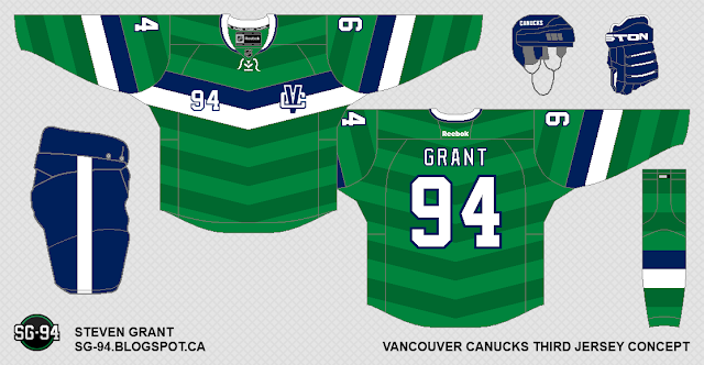
What I like most about these concepts is Steven's tremendous creativity. These concepts are not what you expect a traditional hockey uniform to look like, but they are clever, and well polished. I really do appreciate it when artists try to be creative, and take some risks with designs.
The first version of this concept is a quite risky with the two-tone, sublimated green chevron pattern, and overall it does make the jersey seem a bit busy.
The second one eliminates the sublimated green chevrons, and goes with a simple green base. I really like this jersey with the simplifications.

This type of chest stripe seems right out of the world of soccer to me (clearly during the summer months, my mind seems to go to this world...). It reminds me of the kits worn by both the Canadian Women's National team, and Manchester United, both of which look really sharp.


No comments:
Post a Comment