Friday, December 21, 2012

A HJC Friday!

UPDATE: here is the link to the interview I talked about yesterday... it starts up around 41:30

Well, the holiday season is a time for getting together with friends and hosting them at your place. Today, I am hosting, here at SOAC, HJC's regular friday post while the blog is down. welcome to my virtual living room. While you're here, feel free to poke around, and see what I've done with the place.

As far as HJC Votes go this week, we'll have to figure out what's going on with those, as is, you can't see nominees, so you can't really vote... stay tuned to the HJC blog (if it gets back up and running), and also the HJC twitter account, or facebook page for any news.

I heard a really interesting interview today with Steve Rushin from Sports Illustrated, discussing a recent article of his (well worth the read IMO). If I can find a link to the audio from the interview, I'll either post it here, or on my next HJC, or tweet it from the HJC account. From a hockey perspective Rushin touched in his interview, and in the article on the current state of the game within the fabric North American sports scene. From a jersey perspective he touched the popularity of vintage jerseys, who can get away with wearing a vintage jersey, and where he thinks the NHL will go with jersey and corporate sponsorship over the next decade.

Anyways, it's time to get to today's concepts.

Winnipeg Jets (by Bastian S.)


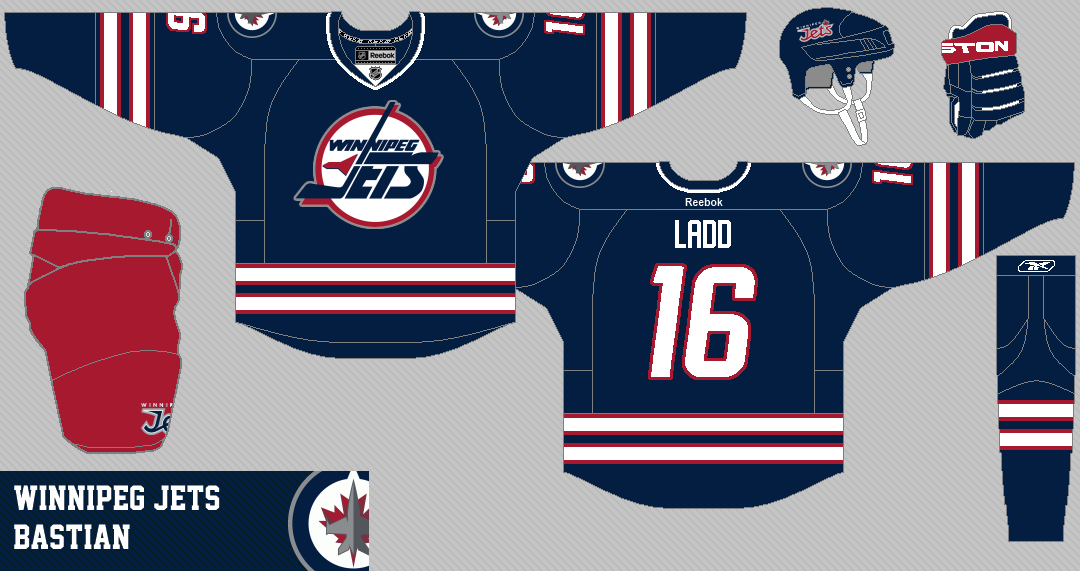
like: the double stripe pattern fits with the other 2 jerseys the jets currently wear. The presence of red on the sweater.
dislike: that both the old and new logos are on the same sweater, this just doesn't work for me. also the collar seems a bit weak.
change: I would either use all new logos, or all old logos, or an up dated version of an old logo (like the one Patrik uses on his concept later on in this post). Shoulder patches wouldn't be necessary in my opinion.
rating: 7/10.


Ottawa Senators (by Kyle C.)


like: I think the Sens are one of the few teams that SHOULD be wearing black as their primary colour at home. I love the uniqueness of the Senators with the gold laurel leaf pattern. Strong and simple jerseys here.
dislike: the small white and red stripes on the home sweater, they don't match the away sweater.
change: make the small stripes one solid white stripe (red might look good too).
rating: 7/10.


Winnipeg Jets (by Patrik G.)
this picture image has a clear background... click on it to see it better!


like: the nods to both the old and new Jets, that updated logo is FANTASTIC.
dislike: the width of the stripes... I would make the red a bit thicker and the white a bit thinner. Also, I really don't like that shoulder patch too much. It seems especially out of place considering it is primarily silver, and there is no other silver on this sweater.
change: resize the stripes a bit, and get rid of the shoulder patch (either go without, or add a "goals for kids" patch, or an updated version of it on one shoulder.
rating: 8/10.


New York Rangers (by Jordan R.)


like: Both these sweaters are really cool. i like that they are inspired by other sweaters, but not actual copies... slightly modernized. The four stars above the text is a very strong look.
dislike: the sheild logo is problematic for me. It is hard to read, and with the chest number (and captain's letter) it would look awkward and crowded.
change: get rid of the chest number on the light sweater. Simplify the shield logo so that text only has one colour behind it... it is really difficult to read the text on the alternating stripes. Maybe try to allude to the current Rangers shield by having the top half red and the bottom half blue and changing the middle bar to white... just a thought.
rating: 8/10.


Winnipeg Jets (by NB-14)


like: the updated Jets jersey. The colour balance is very good.
dislike: again, there is silver in the logos, but not on the sweater.
change: either recolour the logo to eliminate at least the silver ring. also, I would make the red stripes on the arms a tad thicker, and find a way to eliminate the blue from the collar.
rating: 7/10.


Columbus Blue Jackets (by Bastian S.)


like; the simplicity of this set. It is a classic hockey look.
dislike: the random blue bit on the back of the pants, and how "Detroit-y" the pants are... they do play in the same division... so this could be a problem. How small the star is on the cuffs.
change: fix the pants. red is good, just not Red Wings. make the star a bit larger, and place it higher on the cuff (as is, it would likely be covered by gloves).
rating: 8/10.


Nashville Predators (by WinnipegJets96)

like: I really like the blue sweater... it would make a great alternate to go along with what, the Preds currently wear. I love the subtle checkerboard... it was a unique look, and it would have been cool to see the Preds hang on to it.
dislike: the white jersey seems very empty (largely because of the colouration of the logo)
change: I would simply make this concept a one sweater Preds 3rd concept. If you were set on keeping the white sweater I would add blue cuffs, and get rid of the yoke. It might also make the sweater look less empty if the checker board pattern were less subtle (eg. blue and white checks).
rating: 7/10.


Chicago Bears (by Tyler G.)


likes: What a great set of logos/ uniforms to work from. I love the Bears (da Bears!) unis. These keep the spirit of them very well. I also like that the striping reminds me of the black hawks (especially on the white sweater) gotta love a Chi-town hockey tie in.
dislikes: nothing.
changes: I know it goes agains the collars on the football uniforms, but for these hockey jerseys, I would make the collars contrasting.
rating: 8/10.

thanks for dropping by SOAC for this HJC friday post, hope you enjoyed it. Fell free to stop backe here any time!

Saturday, December 8, 2012

Let's get to the sweaters

So for a couple weeks I have been playing around with logo ideas for the Giants. I originally pitched slightly different logos for home and away. I realize that this is often not an option in major junior hockey simply because of the price of producing a second main crest, so I added an outline to the crest used on the light jersey, so it would present better on a dark jersey. Here is the final product I have been working with:


With the logos finalized, I turned my attention to jersey design. As much as I would love it if Reebok manufactured unique sweaters for CHL teams, they don't. They only use existing templates. With this in mind I began to think about which template would lend itself to a classic look, and work well with the Giants logo and my new colour scheme. I had it narrowed down to 2 templates: the Current New Jersey Devils look, or a uniform based off of the New York Rangers 2012 Winter Classic jerseys. Midweek, my mind was made up when Stéphane sent in this brilliant design for the Giants based off the Devils uniforms.

By Stéphane Sinotte

Here is what Stéphane had to say about his design:


1. I agree that CHL teams have cluttered jerseys (my hometown Phoenix are clear winners on that matter!), but I think that keeping the WHL/OHL/LHJMQ and CHL logos are a must. Those leagues need to be known and recognized. I also don't think that Reebok will ever agree to remove their logos on the jerseys. So I say let's work with them when branding a team!

2. Since I want to keep all the logos, I guess we must work with a simple template, with the less possible details (no piping, etc.) and a simple, at the most 3 colors color scheme with a good contrast. That's why I kept the red, the darker brown and the lighter tan - or vintage white - and kept the other colours for the logos and the third jersey.

3. Reebok will not reinvent the wheel for minor leagues! I guess we're stuck with using NHL templates and recolored them. In this case, the Devils jerseys are the ones with the simpler and more traditional look (for a lumberjack theme) on the market.

4. The primary logos are perfect. Don't touch them. Shoulder patches are not needed. Forget them.

5. I'd use the "V" primary on the alternate only. On the particular jersey, I'd go with a lumberjack flanel motif - probably sublimated! - and reversed color on the striping. I'd scrap the shoulder yokes color, but still keep the template for the stitching, it looks like a shirt!. Also, on that one, the darker brown steps aside for the lighter brown to be use.

Having Stéphane send in a perfect Giants uniform set based off of the Devils template freed me up to create on based of my other idea (using the Rangers Winter Classic uniform as a base). I have 2 main reasons for using this sweater. 1) it is a great traditional hockey look. 2) it works well with a shield shaped logo.

Here is what I came up with:


I put Michael Bublé's name, and the number he uses whenever he plays in charity hockey games or practices with the Canucks on the sweater, because Bublé is a part owner of the Giants.

As always, I love to hear feedback from you all, and thanks for reading!

Saturday, December 1, 2012

Evaluating the current Giants' unis

Hello everyone.

I want to take my time with this brand overhaul, and do it well, slowly, and methodically. As for posting on the blog, I will be doing the same. I don't want to bite off more than I can chew and promise 5 posts a week. My goal is to have one post every Saturday for the foreseeable future.

This week's post is fairly simple. I want to give you a breakdown of the Giant's logo and uniform history, and show you some updated logos that I worked on this week (it has been the last week of term, so I haven't put a huge amount of work in on this project this week, but I do want to share what I have done with you).

The Giants have had only minor uniform tweaks over their 12 year history. The biggest change happened in 2009-2010, with the introduction of the Reebok EDGE uniform system in the WHL.

Pre-Edge, the Giants uniforms were largely modeled after the Philadelphia Flyers uniforms from the 90's and 00's, with their dark red, black, and silver colour scheme. 

Images from: sportslogos.net


After the introduction of EDGE, the Giants modeled their look after the Calgary flames uniforms, using the exact same template, but putting black on the yokes instead of the cuffs (personally, I think this is absolutely unacceptable for a Vancouver hockey team for 2 reasons: 1) those uniforms SUCK. 2) No Vancouver team should have ANY ties to Calgary).

Images from: sportslogos.net

I have way more things I am critical of in these uniforms than I do things I like about these uniforms (but some of them are really just general criticisms of CHL uniforms). I am just going to persent these in point form, and create some guidelines for my redesign based on these observations.

WHAT I DON'T LIKE:

GENERAL CRITICISM OF CHL JERSEYS:

-too "cookie cutter." All WHL jerseys are pretty modern looking, and basically based off crappy modern Reebok EDGE templates.

-too many patches. WHL, CHL, REEBOK x2 (with shoulder patches, captain's letter, and numbers this is TOO CROWDED)

CRITICISM OF GIANTS JERSEYS:

-too modernist. You can tell these jerseys and logos were designed near the turn of the new millennium. The colour scheme is mainly black and silver... this is so overdone (black for black's sake, and the phenomenon in the late 90's, early 00's of excessive use of silver).

-the shoulder patches are BORING. what does a flying maple leaf have to do with a Giant anyway?


WHAT I LIKE:

I like the Lumberjack motif, and how it ties in to the Canucks identity. That's about it.


GUIDELINES FOR BY REDESIGN:

Use the Lumberjack motif.

Don't use black or silver in the main uniforms/logos.

Make the sweaters less crowded (I know this will deviate from the current CHL format, but I can wish, right?)

Use a unique jersey template design.

Use a classic striping pattern.

Try to come up with a new shoulder patch.


SO, Based off my guidelines this is what I have come up with so far.

Here is the colour scheme I have come up with (I have included the RGB colour settings in case any of y'all want to send a concept in... hint, hint)


Here are the Logos I presented last week with the updated colour scheme. I have also made a version of the logo without the overhead wordmark, similar to the logo used on the Giants alternate uniform.


As always, I would love to hear your feedback, and if you have any concept ideas for the Giants, feel free to send them along.