Showing posts with label Flying Vs. Show all posts

Saturday, July 21, 2012

Saturday July 21: Evolution of the V

For the weekend's post I thought I would give you a glimpse into my creative process, and show you how these Flying Vs came to be.

I started making hockey jersey in early 2011 (have I only been doing it that long!?!) the first ever design I made was an Ottawa Senators jersey which I posted to my facebook. Soon afterwards I posted a few Canucks concepts, and a my friend David said "Wanna make up a demo for the flying V in blue, green, and white? I still want to see the Canucks try that. With Johnny Canuck as the Shoulder patch."

I did and just that, and here is what I came up with. This is one of my very early designs, so please, go easy on me!


I was very happy with these at the time, but as my skills improved, I knew I would have to revisit these at some point. This was one of the reasons I started SOAC, so that I could revisit some of my old Canucks designs, and apply my improved skills and ideas to them. These were pretty good for having only been designing jerseys for a week or so, but still, there is a lot to be improved upon.

The next step in this process came a few weeks ago when I posted a trifecta of Flying V concepts on this blog from Stéphane, Justin, and myself. Truth be told, I really hated the designs I came up with. They were too busy. Here they are again, anyways.


These looked more like Ms than Vs, but there were elements there which I did like. They just needed some refining and simplifying. That was the next step to come. I finally felt like I was getting somewhere. here are the results of the refining and simplifying.


I was really starting to become comfortable with what I had created, but that is where some more help came along from regular reader and contributor Stéphane, who suggested I cut off the V at the sleeve stripe, and switch some of the colours around. I likes his suggestions, they made the jersey more balanced and logical, while still reminding me of the original Canucks flying V uniforms. Just for fun, I also made up a green version of this sweater. Here are the final versions, which are now posted in the final concepts page.


So there you have it. Those are the finalized flying Vs, and that is how they came to be.

Next weekend I will also have an "evolution" post where I look back at some of my VERY early Canucks jersey designs. This will be a very unique, and interesting post. I won't say more than that. check back for next Saturday for that.

Tuesday, July 17, 2012

More Flying V updates

Hello Everyone, hope you enjoyed the weekend (and monday...), I had a great weekend! Thanks for dropping by SOAC even though I haven't updated the blog in a few days. I feel like I had a really good excuse though, I had a weekend pass to the Vancouver Folk Music Festival and spent the entire weekend outside in the sun (and the rain... this is Vancouver). It was a really great weekend, listening to really good music, in a really beautiful setting.

The festival took place in Jericho Beach park in Vancouver, on the shore or the Burrard Inlet. The park itself has many nice forest groves, and is steps away from the beach (and Pacific Ocean, perfect for a quick dip on a hot afternoon!) and has a wonderful view of the Coast mountains on the North Shore of the inlet.

photo from: 604pulse.com
Even though I took a break from doing any concepts or work on the blog this weekend, it doesn't mean I wasn't thinking about it. Sitting and looking at the ocean and mountains and trees (and their vivid shades of green and blue), I was reminded how perfect the Canucks' colour scheme is for this city. I also want to make a concept inspired by Vancouver's landscape, but I have other things to do and finish up before I take that on, good thing because I still need some time to formulate that idea in my mind.

For today's concepts I have a few updates on the flying V sweaters I posted last week. I had a few suggestions which I implemented, and a few additional options for this concept which I have made up. I have also added a green version.

The big change with all of these concepts is stopping the arm stripes at the piping. This is definitely more in the spirit of the original flying Vs, but steps away from the modern trend to have arm stripes all the way around the arm, over the vertical arm stripes or piping (like the Jets and Kings currently have on their sweaters). I like the way it looks, but am obviously open to suggestions.

Blue Option 1:


Blue Option 2:


White Option 1:


White Option 2:


Green Option 1:


Green Option 2:


So there you have it, plenty of options for modernized flying Vs. Let me know which ones you like best, or if you have any suggestions to make these better! I will be finalizing these concepts by the weekend (I fell like they are VERY close to being complete).

Also, if you have a Canucks concept you would like to send in, feel free to! I hope to feature other people's Canucks concepts regularly on fridays. The email you can send your concepts to is: shirtofacanuck@gmail.com

Thanks for reading!

Wednesday, July 11, 2012

Flying V Updates

Ok, so when I posted my flying V concepts last saturday, I didn't love them. The more I looked at them, the more I hated them. They were too busy, and the V was entirely lost. With the vertical arm striping the overall shape of the sweater was an M. I liked the idea I had, but couldn't come up with any design which I really liked.

So I took a step back and worked on another non-Canucks concept for a while, and came back with fresh eyes. I simplified my concept, using Stéphane's suggestion to do away with the coloured arms in favour of simply using the outline to suggest the arm stripes from the 1978-85 flying V jerseys.

Here is what I have come up with:


Home Uniform:


Away Uniform:


Let me know what you think.


Saturday, July 7, 2012

Finally, Some more Flying Vs

Hello again everyone. It has been a slow week on Shirt of a Canuck this week (mainly because it has been a busy week in real life for me). It is the first beautifully sunny Saturday of the summer here in Vancouver, and I (of course) am at home with a cold (probably because I had a busy week). That just means I can catch up on the blog.

Over a week ago I posted concepts from Stéphane and Justin, and hinted at upcoming posts. Today, one of those upcoming posts is here. Today, for your viewing pleasure, I have some blue and green Flying V concepts from Stéphane, Justin, and myself. What I like most about all of these concepts is that they are all very different.

Without further ado, here are the concepts:


Justin's striping design stays very true to the original, with the Vs in the arm stripes. I was unsure about using the stick in the rink logo as a shoulder patch, but it seems to work here. The one thing I would change on this concept is the partial green cuff stripe, I would just keep it blue.

A while ago Stéphane sent in a Flying V concept in the Canucks' Hallowe'en colours. He has sent in a couple more versions of this concept in blue and green. As you will notice, the players he has selected to use for the names and numbers are not Canucks. Stéphane is a Habs fan, and is still a bit sore about losing Lapierre, and has proposed a few trades to me in an attempt to get even for the Lapierre trade. As the unofficial GM of the Canucks I have acquired Scott Gomez from in exchange for a enough money to pay the Electricity Bill in Roger's Arena for the next few seasons, and a one way ticket to Chicago. This jersey would never happen, because Gomez would never wear a Canucks sweater (a Chicago Wolves sweater, maybe?).


My only complaint for this sweater is the use of the Orca logo, which I do not feel represents the Canucks brand well. Other than that it looks awesome.

Stéphane has also sent in a green version, with the Johnny Canuck V logo. This one also looks really good, except for the name on the back. Number 22 IS NOT AVAILABLE.


This is better...


I just wanted to do a version of the Flying V which was different from any other version I have seen.  I don't really like how the arm stripes on the original Flying Vs only go part way around the arms. This was a big complaint with arm striping when the Reebok Edge uniform system was introduced. Recently a few teams have taken steps to fix this (notably the LA Kings, and Winnipeg Jets) I started to imagine it based off the Jets away jersey with the arm stripes going all the way around the sleeves, and over top of the vertical striping on the sleeves. What do you think? was the experiment a success?

I also made a matching road version. And since it is meant to match, I didn't really have a choice as to which player I chose for the name and number on the back of the sweater.


Thanks for stopping by!

Friday, June 29, 2012

Concepts From Friends Friday!

Hello everyone, we've made it to another friday!
Today I am excited to introduce a new feature on the blog which will hopefully become a regular thing. I have mentioned on previous posts that I have set up an email account for the blog (shirtofacanuck@gmail.com) and am accepting concept submissions (obviously Canucks themed) to be posted on the blog. 

I have had some awesome contribution on the blog from some other fellow bloggers (Stéphane from Le Troisiéme Chandail, and Justin from The Art of Hockey), this has not only been through comments and suggestions on my concepts, they have also sent in some of their own work to me.

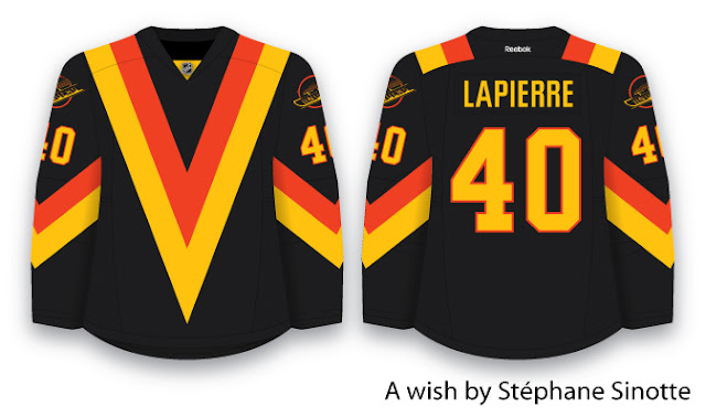
Stéphane's work strays a little from the blue and green brand identity that I, as a 21 year old Vancouverite, see fitting best for the Canucks. Nonetheless, Stéphane's work is flawlessly executed, and creatively based in the era of Canucks history which he identifies with most strongly.


As Stéphane wrote:


I don't know why most Canucks fans don't want to talk about the "big Vs" years… For me, those jerseys represent the real Canucks. It reminds me of Tony Tanti, Stan Smyl, Richard Brodeur… The years when the Canucks were in town (Montreal that is) with jerseys that no other teams could match: different, original, new. I sure wish that they could bring back that black jersey with the dominant V as a third (cause I really don't believe they will step away from blue and green now).

Obviously to complete this "wish" Stéphane would like the name on the back of the sweater to be GOMEZ instead of LAPIERRE, but seeing as Mike Gillis has again proved himself a capable GM (with the recent Schneider signing), I don't see that happening anytime soon.

I really like this design. It is way more logical than the original flying V sweaters, but does not lose any of the boldness of the original sweaters.

I have really grown to enjoy the flying V sweaters (I definitely want to add one to my jersey collection!). Stéphane mentioned that he doesn't think that the Canucks will abandon the blue and green colour scheme, but to bring back the Vs, you don't necessarily need to bring back the hallowe'en colours. One of the first ever concepts I did was a Flying V jersey in blue and green. This post acts as a bit of a teaser for the updated version I am working on. Look forward to that in the next week or so.

Justin has also sent in a great concept. A few weeks ago when I was working on green alternate sweaters, Justin sent his take along.


There are a number of things I like about this concept, love the green, love the fact that Justin does not shy away from the striping (I tend to be way more minimalist when it comes to stripes, Justin is brave enough to make all these stripes work!). I also love the logos. That VC logo is a hidden gem, and I have no idea why the Canucks have not used it on a jersey yet.

His presentation of the full body skating Johnny Canuck logo is one of the two ways that I have seen work on the front of a jersey. The second is the way I presented in this post, which I admittedly did not come up with. I think I first saw it some sort of Canucks official merchandise (maybe a T-shirt or flag). By itself, the skating Johnny Canuck logo seems awkward and unbalanced to me (almost as awkward looking back on this photo retrospectively after the 2011 Stanley Cup final...). Even Tanner Glass can't make these jerseys look great, although if having awkward looking sweaters for the rest of time meant having Glass back on the Canucks, I would seriously consider taking that offer, what a gamer!


I like the old-timey vibe I get from Justin's green third jersey, and have encouraged him to push it a little further. Justin came to me with the idea of collaborating on a Canucks jersey set. His third with my home and away sweaters. This is really great because together we can make all of our jerseys better. When we finish our collaboration, I will definitely post it. Consider this another teaser!

Anyways, that is all I have for today. Check back for Canada day stuff this weekend. Next week I am going to continue working on the classic uniforms, hopefully we can make some headway on those and get them wrapped up by the end of next week.

Thanks for dropping by!