As you may be able to tell from reading this blog, when I design hockey jerseys, I am not afraid to draw inspiration from other sports, or sports teams, or sports teams kits. And as you may be able to guess, I am a big fan of many sports teams in the Pacific Northwest. In 2011, Vancouver Whitecaps FC joined Major League Soccer. This moved has really raised the profile of soccer in the Northwest, and has propelled the Whitecaps (and soccer) to second place in terms of my favourite teams/sports (the Canucks and Hockey will always be number 1!).
One thing that is really great about soccer is the local rivalries (hockey could really take some cues from this I think), and the local rivalry between the Seattle Sounders, Portland Timbers, and Vancouver Whitecaps is always fierce. Every year the Cascadia Cup is awarded to the team from this group who fared best against their rivals. The Whitecaps have won the Cascadia cup 3 times since it was first awarded in 2004, and look poised to win it again!
The trophy is named for the geographic region which these teams are all from. There is a movement in the Northwest (British Columbia, Washington, Oregon) to break away from Canada and the USA and form an independant country called
Cascadia. Although there is a distinct culture shared by the inhabitants of these areas, this movement is not well supported (it is more of a cultural thing than a political thing), but is nonetheless interesting (check out wikipedia if you are interested...clearly I was).
Supporters from these clubs (especially the Timbers Army) have really embraced their Cascadian identity, and have begun to fly Cascadian flags at matches. When I first saw them, the first thing I noticed was that they are blue, white, and green. THE SAME COLOURS AS THE CANUCKS!
My concepts for today are similar to the
Canada day concepts I posted. Instead they feature the Cascadian Flag in the Stick in the Rink logo. I have also put a modified version of the Cascadian flag on the arm stripes, with the douglas fir acting as a patch on the sleeves. The stripes all follow the colour and pattern of the Cascadian flag. The jersey itself follows the current Canucks alternate template, but with forest green as the main colour rather than blue.
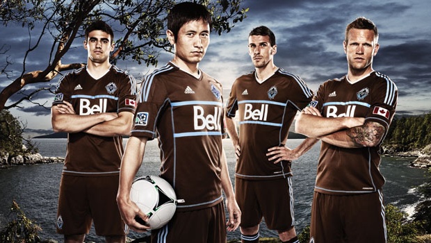
In soccer it is much more acceptable for a team to use a colour which is not in the teams colour palate as a main colour on an alternate kit. The Whitecaps have recently introduced a BROWN kit (I didn't like it at first, I was hoping for a light blue throwback uniform, but it is REALLY growing on me). This practice is not so acceptable in the world of hockey, but if it were more acceptable, I think forest green could look really good on the Canucks.
Anyways enough with soccer and secessionism. You came to see concepts so I'd better get on with them.
Home:
What better player to feature on the back of these sweaters than Jason Garrison. Glad to have a local boy (from White Rock, Cascadia... errr BC!) and one of his quality join the squad.
Away:
Come back tomorrow to see some concepts by a new contributor.
As for next week, I can't promise t will be as productive as this one, but I do have plans to re-work the
green alternate sweater which I designed a while ago. We'll see how that goes.
Thanks for reading!


No comments:
Post a Comment