
.png) |
| Municipal Flag of Vancouver |
Today's concepts are based off of the municipal flag of Vancouver.
 |
| Provincial Flag of British Columbia |
The concept by Jets96, which I posted last friday really got me thinking. I said that it reminded me of the Drummondville Voltigeurs sweaters. I have wanted to design a sweater based on the flag of Vancouver for a while, but was hesitant to because I wasn't sure how to deal with the wavy lines. I didn't want it to end up looking like this. Seeing Jets96's concept, and seeing that the Voltigeurs sweater also had a V logo with a Voltigeur (infantryman) gave me some direction with this idea.
here is what I came up with:


These sweaters are not a simple transfer of the flag to the sweater (as I have done with my other flag jerseys), there is more symbolism employed.
 Firstly, I realize that the striping does not look exactly like the stripes on the flag. The stripes are supposed to represent water, so I tried to combine some ideas from other teams sweaters which have used stripes to represent water (notably the Rimouski Océanic, on their logo, old sweaters, and new sweaters), and fit them within the basic shape and patter of the Voltigeurs (which forms a slight V, to stand for Vancouver, in this case)
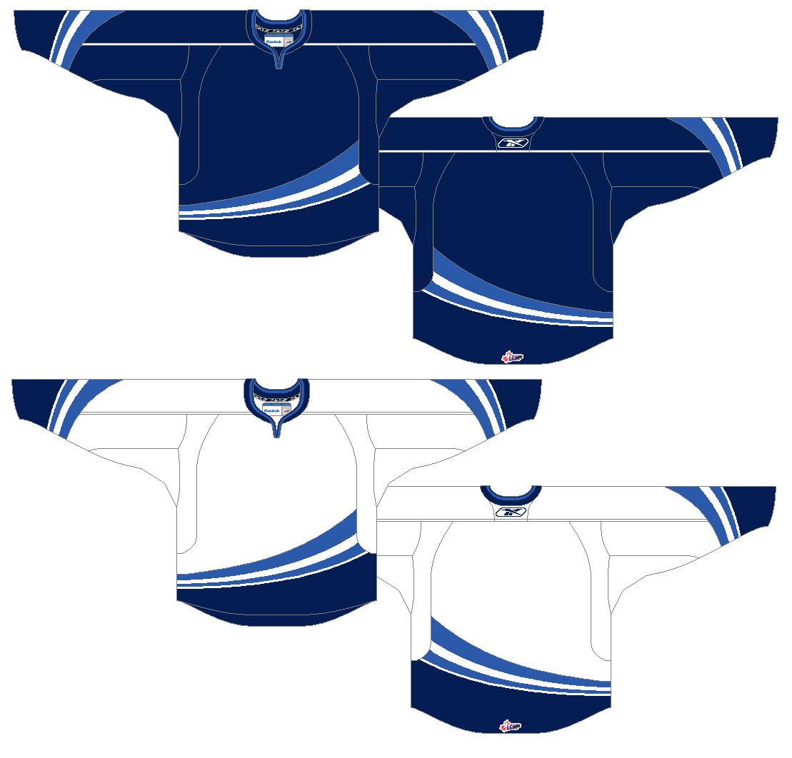
.png) another thing I like about this slight V is that it is similar to the V formed if You rotate the Vancouver municipal flag.
another thing I like about this slight V is that it is similar to the V formed if You rotate the Vancouver municipal flag.The seafaring trades represented on the flag by an oar, and the ocean are represented on this sweater by the ocean only, while forestry is represented by everyone's favourite lumberjack, Johnny Canuck.
Let me know what you think of these. They were something I threw together just for fun, and I am not super pleased with them, but do think that there are some interesting ideas here. I would be really interested to see what you all thought, and to hear any suggestions you may have.
Thanks for dropping by!
No comments:
Post a Comment